“Folds and Unfolds” of Coworking Nº 1 – The Rose: How a cube can become a beautiful flower
The Cube and the Rose. Image Source
See a full video tutorial here
Hello everyone,
We will start a series of articles on the different sides of coworking. As you may have noticed at this point, coworking cannot be defined in a single way nor can a coworking space be built following three simple rules. We will try to use origami as a metaphor to talk discuss the different perspectives of coworking – aka, coworking “Folds and Unfolds”.
Why use origami? If you have ever played with origami, you would realize:
- Although it is not easy, you can start with basic shapes and slowly move up to more difficult shapes.
- Following instructions is not a guarantee of the final result to be perfect, it can always be different. For example, the result could be different if you use different materials.
- Origami is fun and beautiful – just like coworking!
We are setting up different categories of articles depending on the subject. In this first one, there is an approach to the spatial qualities of the space itself – the place to host a great community. Is it possible to open a coworking space anywhere, despite the place? In this article, we will try to start with an important feature that plays a main role in the final configuration and perception of the space – the height.
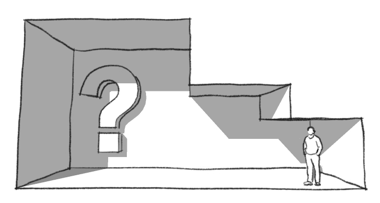
Taking a look at resources like Neufert Architects' Data, there are some references about proportions: "Spaces with high ceilings, where the eye has to move around to have a complete view, produce a feeling of freedom and wideness, but the distance between walls and general proportions still have to be correct". Throughout history we can find many studies on the relation between the body and the space, such as the Leonardo Da Vinci’s Vitruvian Man, the work of Leon Battista Alberti, or the 20th Modulor by Le Corbusier.
Some tips that may be considered regarding the height of the ceilings:
- High ceilings with correct proportions may produce a perception of wideness. When the ceilings are too high in relation to the distance between the walls, the space is often perceived to be smaller.
- When discussing heating bills, high ceilings can increase them because warm air raises. A ceiling fan can help to circulate this warm air back to the floor.
- Can high ceilings influence our creativity? According to this article of Psychology today, the answer is yes.
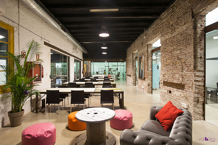
- The way sound spreads throughout the space also effects how we perceive sound. We can feel sound of a person who is farther from us when sound is bouncing off the high ceilings. This situation may produce a feeling of a less intimate space.
- On the other hand, we can set up different heights on ceilings to achieve different types of spaces such as, looking for intimacy with low ceilings for meeting rooms or using high ceiling in our events rooms.
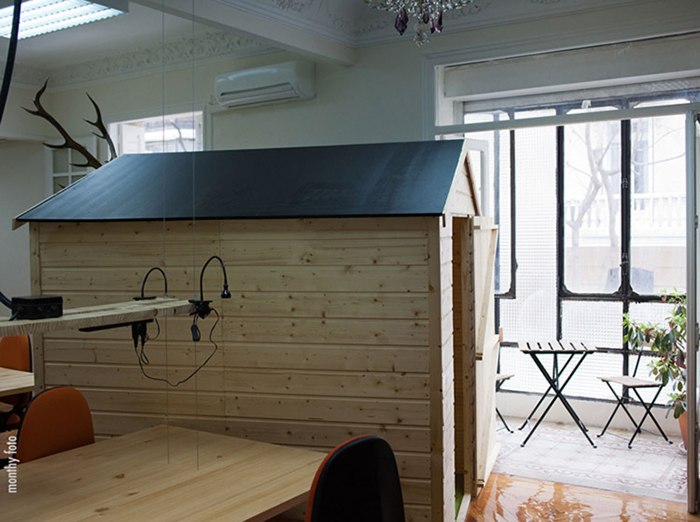
Meeting room / The Shed.Co coworking Madrid
- Another key point is the lighting in spaces with high ceilings. It is important to achieve comfortable levels of illumination at desk planes; therefore, the lighting system should then be carefully selected.
- With higher ceilings it is also easier to light the space with natural illumination.
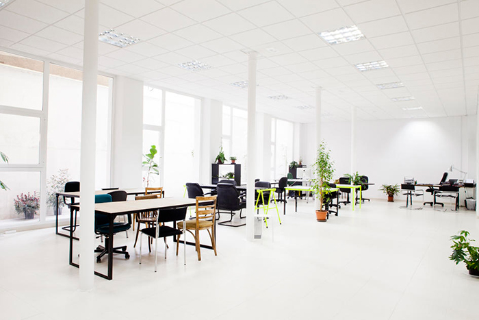
Lanau coworking space. Madrid
As you can see, just like everything else in the world, high ceilings have their pros and cons. As we said before, it may be a good choice when it is possible, to have a sequence of different spaces and heights. This gives the person who inhabits the space a rich experience. In the history of architecture, there have been many changes over throughout the past centuries. During the 19th and early part of the 20th centuries, ceilings were reasonably high – around 3.5 meters – which was changed by the postwar era. Arguing about optimization and economic reasons, architects and builders started designing lower ceilings – around 2.1 meters, using the minimum legal height as a reference.
I recently came across a film about Charles and Ray Eames, called “The Architect and the Painter”. In this film you could see the ‘Office’ – a huge warehouse where they have their studio. As they worked with a big team of people with different backgrounds producing furniture, films, houses, and other necessary items, the space needed to be flexible and dynamic to change quickly from one discipline to another. They had a principal space that was continuously changing on demand, and other small spaces that allowed to work with more privacy and intimacy. Another example of rich spatial configuration is the Eames house, which uses heights to create different atmospheres.
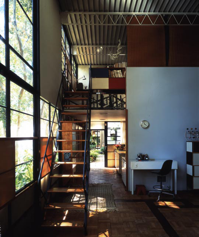
Eames House. Image Source
This is an open organic article, which means that we will be more than happy to hear your comments and feedback so this information can grow. ¿How do people experience your own coworking space? ¿Do you have high ceilings in your space?