Upgrade to Version 4 of the Members’ Portal Today
After weeks of teasing, and drip-feeding information about the latest version of the Members’ Portal, we are thrilled to announce that from today, Thursday 22nd April, you can make the move to the latest version!
Our team has been working tirelessly over recent months to ensure Version 4 is truly the best version of the Members’ Portal yet. And, if we do say so ourselves, they have certainly achieved that! We hope you are as excited about the release of the latest version as we are, but for those of you who are still undecided about whether to upgrade, we will go over some of the best and most significant changes here, to give you a sense of what you’ll be missing out on if you don’t decide to make the move to Version 4. We will also be going over the steps you will need to take to upgrade later on in the article. So, here goes…
Why you should upgrade
Fresh and modern new UI
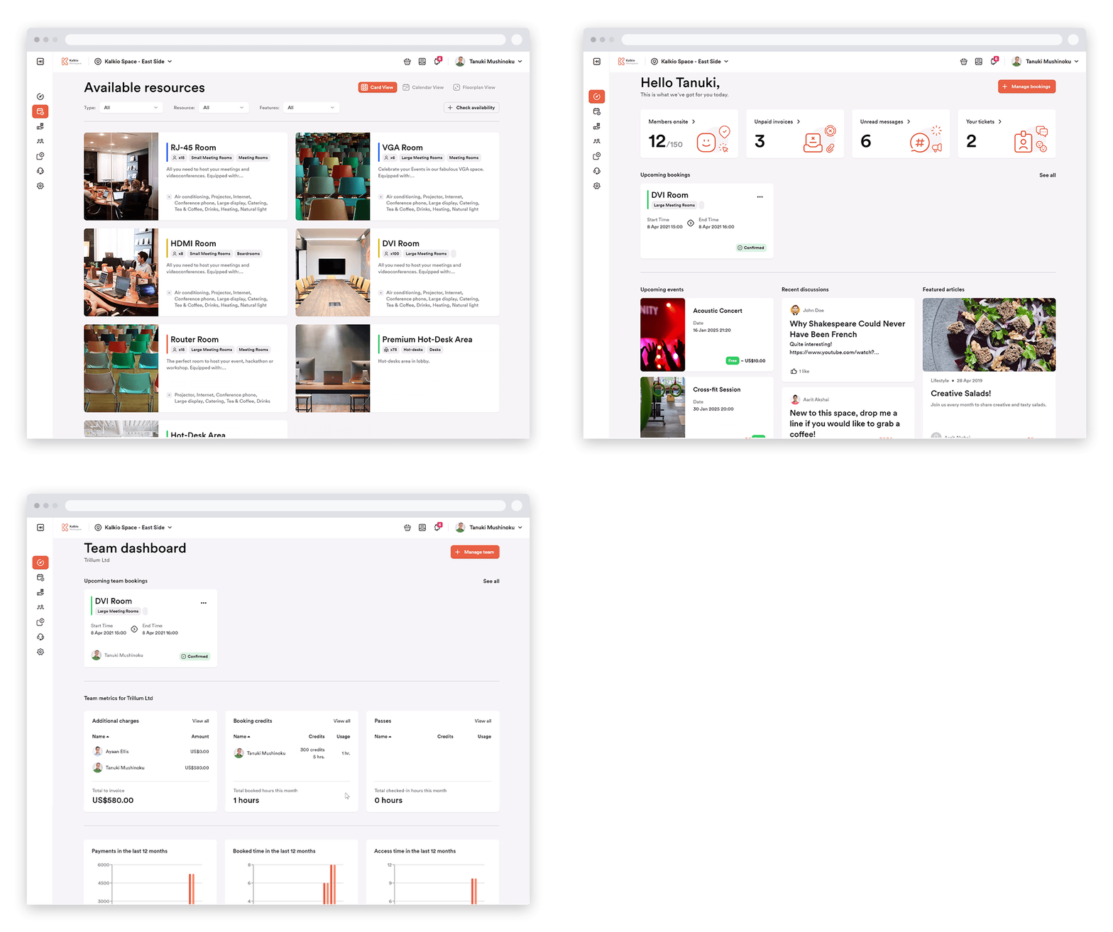
Like all things, after some time a new lick of paint will be needed. That was one of the starting points for the new Members’ Portal. We thought the old design was beginning to look a bit dated and worn out, so we have completely revamped the look and feel with Version 4. While still being the Members’ Portal you and your members know and love, it is far more pleasing on the eye and provides the best user experience of any version we have previously released.
The best UX we have ever delivered
Along with the updated look and feel, it was vital for us that Version 4 of the Members’ Portal delivered a stunning user experience and was easier to use and navigate. Over the years we have gained invaluable insights from users about how members use the portal and which features are most important to them. We have kept these insights at the heart of all the changes we have made, and are so proud of how this new version was made possible through the feedback we received from our amazing network of users.
In terms of the actual changes that have been implemented, we have made lots of little tweaks rather than wide-sweeping changes. We wanted to ensure we maintained the user flows that members have become accustomed to, so as to allow for an easy transition to Version 4. Some of the tweaks we have made to make life easier for users include:
Allowing new users can now set a start date when purchasing Plans, directly from the card, simplifying the process.
Note: The rest of the sign-up process has remained the same
When purchasing products, new users can simply add them to their shopping cart rather than immediately being directed to the sign-up page.
When users navigate to their basket, they are then able to either sign in or create an account.
Improved mobile compatibility means users can have the best possible experience of the Portal, regardless of how they choose to access it.
New functionality
Courses:
As well as the new look and tweaks to the usability of the Members’ Portal, Version 4 also includes some new functionality that really improves how your ability to foster and strengthen the community of your coworking or flexible workspace.
The marquee addition here is the introduction of the brand new Courses section. This feature provides a dedicated area in the Members’ Portal for you to offer educational content and training material to your members. These courses can be broken down into a number of sections, and you can set requirements that need to be completed before members can progress to each different section.
Signing up for these courses couldn’t be easier. Members can either enrol themselves directly from the portal or alternatively, you can manually add new course members from the Admin Panel. Learn more about this new feature by reading our dedicated Knowledge Base articles.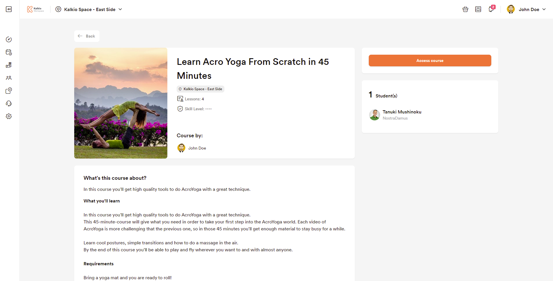
Floorplans
We have also updated the floorplan view that members can use when booking resources in the space. When a resource is selected in the floorplan view, a side panel will now appear showing all the features of that particular resource and allowing it to be added to the user’s basket. We have also worked hard to make the floorplan view more mobile-friendly, meaning using this view on mobile devices is now a much simpler and more navigable experience. 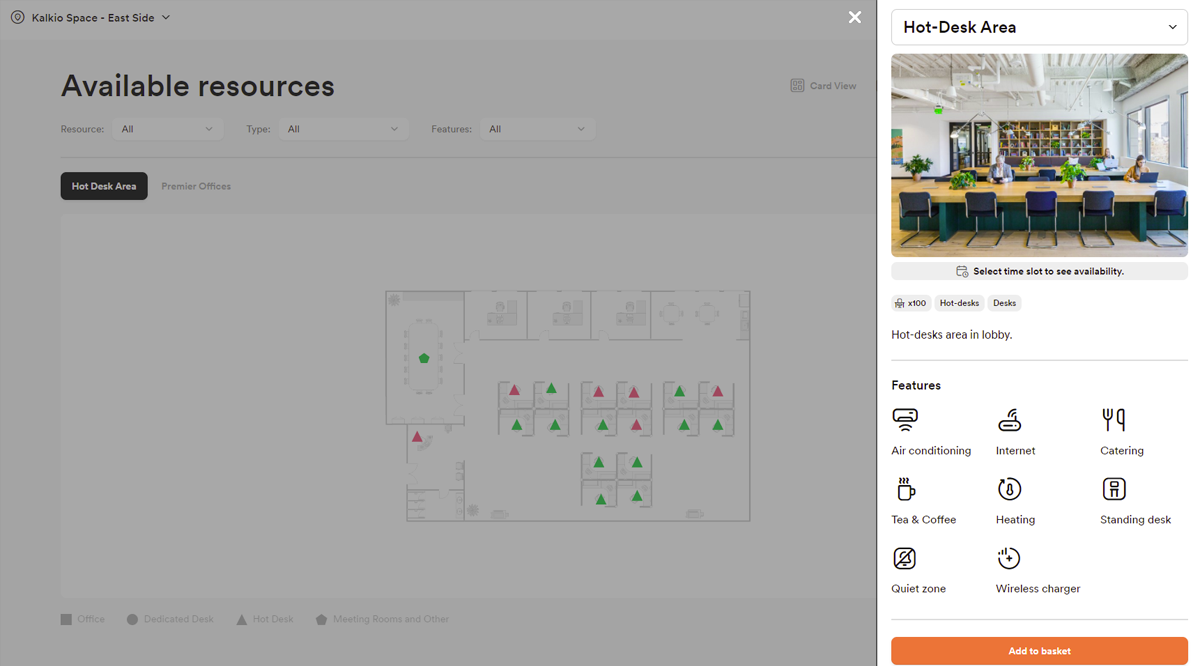
How to upgrade to Version 4
We hope you can see the benefits of upgrading to the latest version of the Members’ Portal, as we mentioned earlier, we have done everything possible to improve the portal and the experience it offers while retaining the same basic structure, to make the transition as smooth as possible.
Equally, we have endeavored to make the process of moving over to Version 4 as easy as possible. However, the process of upgrading will differ depending on whether or not you have made customisations to your Members’ Portal.
Spaces that haven’t made any customisations to the Members’ Portal
For spaces using the template as-is, without any customisations, the process couldn’t be easier. All you will need to do is respond to the notification in the Admin Panel. If you haven't been in touch with us to request an upgrade, your portal will automatically be upgraded after 40 days. It really is as simple as that.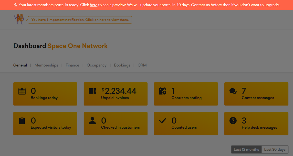
Spaces that have made customisations to the Members’ Portal
If you are looking to upgrade to Version 4, but have made customisations to your Portal, you will need to get in contact with our support team before you upgrade. This way, we can provide you with a new template, and ensure that none of your customisations will be lost.
Please note that your account will not be automatically updated so you are not at risk of losing your customisations. However, if you choose to move to the new version without having one of your developers transfer those changes to the new version of the portal, these customisations will be lost. 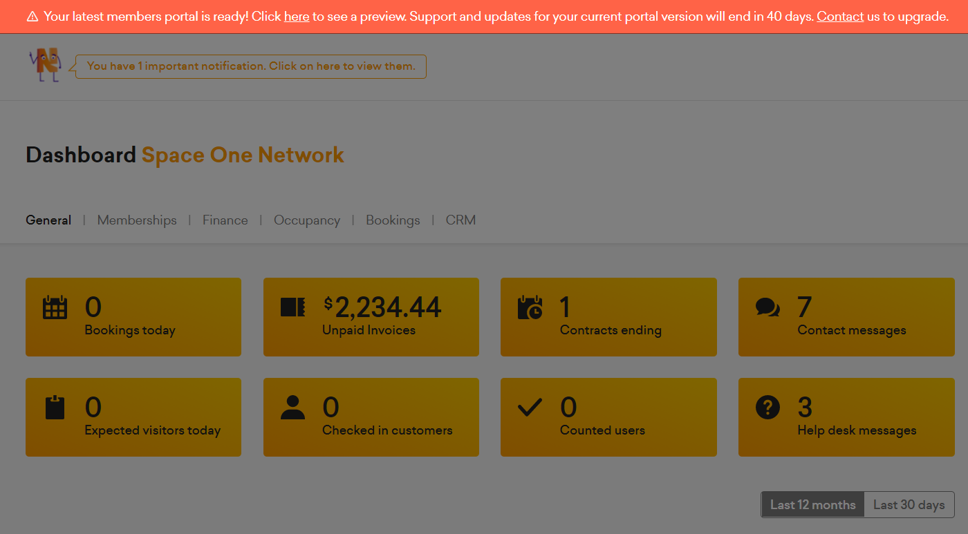
For detailed instructions on how to upgrade to Version 4 of the Members’ Portal, head over to our Knowledge Base article, which will walk you through the process step-by-step.
Related posts
-
Why a CRM is Essential for Coworking Spaces (And How to Choose the Best One)
A customer relationship management platform (CRM for short) is what organisations use to manage relationships and interactions with both existing and potential customers. Its primary function is to streamline operations and communications to ensure a smooth customer - and employee - experience, while improving profitability.
-
How the Right Coworking Software Can Transform Your Coworking Space
We all know that technology solutions are imperative to the day-to-day running of your coworking space, but the right coworking software can take it to the next level. It has the power to transform your coworking space into a highly profitable business, all while building a vibrant and engaged community. Let’s explore how the right tools can transform your coworking space.
-
New in Nexudus: Reduce no-shows & improve team bookings in your coworking space.
Meeting rooms are at the heart of collaboration in coworking spaces. Whether it's a brainstorming session, a client meeting, or a team catch-up, having a simple and efficient way to book and manage meeting rooms makes all the difference. But let’s be honest—there’s always room to improve the experience for your members.
-
Unlock New Revenue Streams with Our New Virtual Offices Module
The popularity of remote and hybrid working has prompted many organisations to rethink the way they utilise office space. Many have swapped their large, static HQs for more flexible satellite solutions that can accommodate a disparate workforce.
-
ViDA Compliance Guide: 8 Essential Steps for Coworking Spaces in the EU
Now that 2025 has arrived, the European Union's VAT in the Digital Age (ViDA) initiative is becoming a key topic for coworking spaces operating in the EU. But don’t panic—ViDA will be introduced gradually, with key changes taking effect from 2028. This major VAT reform aims to modernize tax reporting, combat fraud, and streamline compliance through mandatory e-invoicing and real-time digital VAT reporting for certain transactions.
-
Harnessing AI to Help Coworking Operators Understand Their Communities Better
After more than twelve years in the coworking industry, we’ve seen the movement evolve at an incredible pace, especially in recent years. Spaces have grown larger, making it harder for operators to truly connect with their communities. At the same time, expectations for higher service standards and increasing competition mean that creating tailored experiences and fostering long-term member engagement is more important than ever.