New Members' Portal - What changes should you expect in the newest version?
Depending on what type of coworking or flexible workspace you are running, your members’ expectations are bound to be highly varied. However, no matter who they are or the nature of the work that they do, one thing that you can guarantee will be high on the priority list for each and every one of your coworking members is convenience.
Your members don’t want to use different, disparate websites and systems for their room bookings, invoice payments, product purchasing and so on. They want each of these possibilities available to them in one place, and this is exactly why we provide this capability through our Members’ Portal.
If your space has been using Nexudus for some time, then you will be more than accustomed to what can be achieved by using the Members’ Portal. What you should be aware of, however, is that this is set to get quite the overhaul!
As you will have noticed through our recent communication, we’ll shortly be adding some changes to your Members’ Portal. We’ve shown you a mockup of what your new Members' Portal will look like from a prospective member's view, we've informed you of the actions you will need to take as Admins before rolling over to the new version... now it's only right that we actually show you the kind of changes you should expect to see from inside the Portal! Here, we are sharing with you a few of the newest most significant changes that you should expect to see, and what updates will be included as a part of the new release.
And if that wasn't enough, we'll be giving you the chance to see the new Members' Portal in all its glory for yourself, by allowing you to preview your own data in Version 4 of the Portal!

Reimagined, more navigable interface
One of the first things that your members will notice when navigating their new portal for the first time is its reinvigorated layout. We have incorporated a fresh new design that, as well as being more visually pleasing for your members, promises a better user experience from start to finish. Our biggest upgrade to the Members’ Portal yet, the new look really is simply the icing on the cake.
Updates to My Dashboard
Your members will visit their Dashboard to organise everything that they have going on as individuals, relating to your space. We know that nine times out of ten, this will be the first place that your members choose to visit when using the Portal. So it’s only right that we gave it the update that it deserved!
It’s no secret that so much can be achieved by using the Members’ Portal — this much is clear by the various tiles that you will be used to seeing when you visit your dashboard. There are several usual suspects that your members tend to use most often, and we have chosen to highlight the following, most critical information as tiles sitting front and centre on your home page.

Members onsite:
Before making a decision on whether they’d like to head to the space, your members may want to get an idea of how many people are in already, and whether there will be room. Particularly in light of the pandemic, your members may be more concerned about limiting their exposure to others. From the dashboard, you can see how many members in the space, compared to its capacity. By clicking on the header, your members will be able to see how many members are currently in each of the spaces in your network. We’ll even save your members from doing the math by summarising its busy status!


Unpaid invoices:
You’ll definitely want to encourage your members to use this one if you don’t want to be chasing them down for payments! This tile will display an immediate notification if your members have any outstanding invoices. By clicking the header, your members will also have the option to see their past invoices and download their statements, view their upcoming invoices, and update their billing, company and payment details.

Unread messages:
Never miss another invite to coffee again! Not only does this tile provide a much clearer indication of new messages than was available in Version 3, clicking it will also enable your members access to the discussion boards, where you can see the threads that you are following, and create new conversations with your fellow coworkers.

Your tickets:
If you host in-person or virtual events in your space, you’re going to want to remind your members about them! From here, your members have the option to automatically send their ticket to their email, and to cancel their attendance.
Updates to My Team Dashboard
Graphs and metrics:
Of course, your members will not just want to gain an understanding of their own activity and interaction with the space, they will also want to know more about their team too. Who has made use of the passes your team was assigned? Who has the most amount of booking credit remaining? And of course, which member of the team has received the most additional charges…!
To make this information readily available at a glance, we have moved the graphs and tables that were previously accessible in the metrics section. We know that when you are hoping to gain an understanding of your team’s activity, both seeing this information in a visual format such as a graph, and having it all in one place will be indispensable to your member base.
Manage Team:
The main difference here is that when you are selecting the industries and markets that your business operates in, you will now be presented with a list of possible values, as opposed to having to enter these yourself.
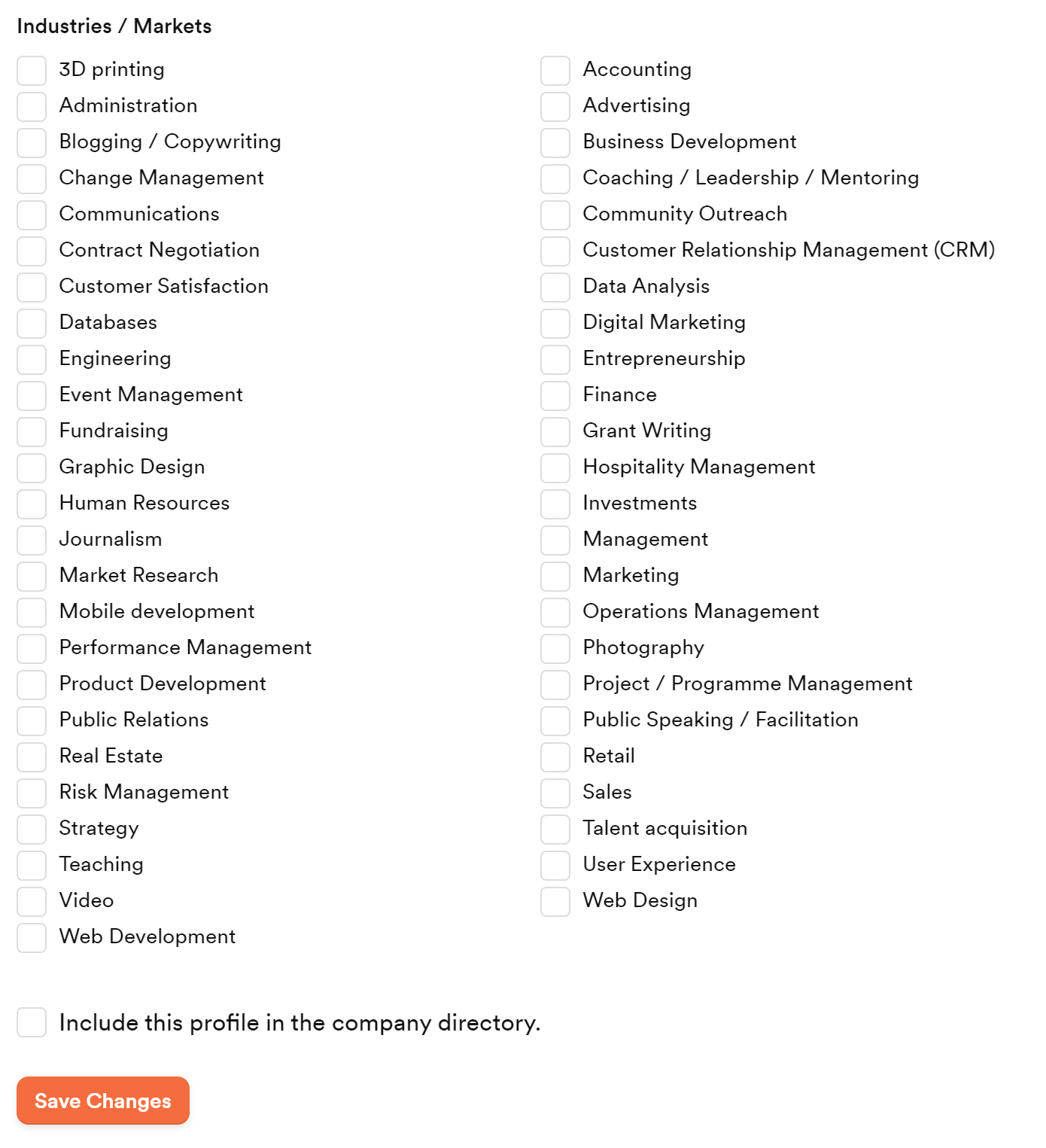
If you do not find any categories that are relevant to your business, fear not! If you get in contact with support, they will easily be able to make individual options available to you.

Improvements to mobile-friendliness
It's no secret that mobile web traffic is higher than it has ever been. As more than half of all online traffic comes from mobile - a whopping 55.56 per cent - we knew we would not be providing adequate value to your members by providing a Members' Portal that didn't perform up to standard on mobile.
We recognise that as well as making use of our member-facing companion app Passport by Nexudus, members will also want to access their Members’ Portal on mobile, as more often than not, it can be the quickest way to complete actions such as making a booking. As well as its speed, responsiveness, and its ability to perform almost like an app, members will relish the fact that the side panel will expand into a list view, enabling them to navigate to whichever area of the platform they would like to go to.
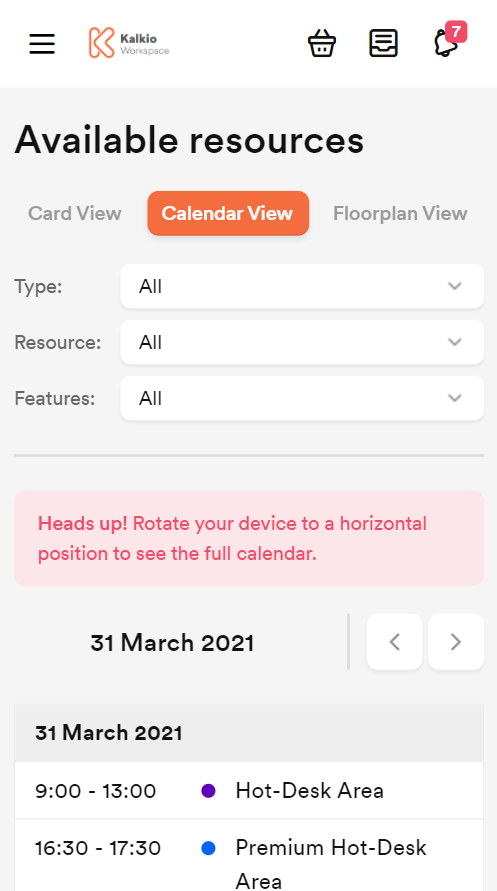
When looking at their booking calendar on mobile, to see the full calendar of available resources, your members will want to look at this from a horizontal/landscape point of view. Not to worry if they do forget, we’ll remind them, as you’ll see in the above image.
Improvements to community boards
Here, we have also added an exciting new feature - as opposed to needing to open up a conversation to make a comment, your members can now engage in conversations directly from the discussion board itself. It's the little things!

Have a cool video that you’d like to share with the community? Any YouTube video that you post on the discussion boards will now render a preview, allowing your fellow coworkers to see the type of video that you are sharing, without having to click on the link. All you will need to do is paste the link when typing a message into the Message section when starting a new conversation.

Intuitive new user flows
As the new Portal has been completely redesigned with usability in mind, we have mapped out each possible user journey to create intuitive new navigational flows for the following processes:
Making a booking
Your members will make bookings in a more sensical way. Either by selecting Bookings from the dropdown menu on the left or by hitting Manage bookings on the top right of the dashboard, they will be taken through to the Bookings Settings page, where they will be able to make a booking.
From here, your members will have three options: Card View, which will show each of the resources available, with images and amenities on display, Calendar View, which will open the bookings calendar, allowing your members to make their decision based on date and time first, and Floorplan View, which will allow your members to visualise the space to help them make a booking choice based on proximity in the space and to certain amenities.
Purchasing a product
One of the changes we have made in Version 4 of the Members’ Portal is to simplify how members can purchase products and services. Previously, it wasn’t immediately obvious where in the site to navigate to buy passes, services, and benefits, so when we were thinking about possible changes to make, this was high on the list.
As we have mentioned above, making the products and services you have to offer more prominent and easy to find for members was very important to us, as in the old Members’ Portal it wasn’t immediately visible. Its new position as a tab in the sidebar makes it so much easier to find. Not only that, but we have changed how your products and services are now displayed, to make them more attractive and appealing, which will hopefully allow you to generate more sales.
Purchasing a ticket
It’s never been easier for members to purchase tickets than it is in the redesigned Members’ Portal. With its designated tab on the side panel, members can now easily see the events that are happening in your space. The new, more intuitive layout puts your events front and centre, ensuring your members don’t miss out on everything your space has to offer. It is now also easier for you members to switch between different views, making it a breeze to see upcoming events in either a card view or in calendar view. We have also revamped the layout for individual events, putting all the vital information such as dates, times, locations, and ticket prices in more prominent positions, which will make promoting your events that much easier.
Courses
Another exciting feature that we have added to our latest version of the Members’ Portal is a section dedicated to offering educational content and training material to your members - cue courses!
Your members can now use your Members’ Portal for learning purposes by registering for courses that you have set up through the Admin Panel.
These courses can be broken down into a number of sections, and you can set requirements before members are able to move on to each different section. For example, you may choose for certain sections of the course to become available once your members have completed the previous section, or you may choose to set the lesson unlock type as timed, so that your members will have to have been enrolled on the course for a set amount of time before they are able to progress.
So how do members sign up for courses? Simple - your members can either enrol themselves in courses that have been made available on the Members’ Portal or you can manually add them as course members from the Admin Panel.
Finally, as you begin to expand the different courses that you offer, you will have the option to organise these into groups. As well as keeping things more organised in the Admin Panel, placing your courses into categories will also make your educational content a lot easier for your members to navigate from your Members’ Portal.
This ease of use should help and encourage your members to take advantage of the opportunities your space is able to provide, and increase engagement across the board.
Reminders
As users of our previous versions of the Members’ Portal, we’re sure that you’ll be more than acquainted with the reminders you will receive if you have not completed certain tasks. As we know that this can often be the most effective way to inspire action, we have some additional reminders, to give you the productivity boost that may need on some days more than others!
New reminders will now be triggered:
a number of days after deliveries have not been collected
a number of days after the first contract start date.
Both these new reminders, and those you will have had in the previous version of the Portal are customisable to whichever number of days makes the most logical sense for your space.
Additional RADIUS attributes supported
We know that each and every space that we work with is different, and each has different, often contrasting technical requirements and specifications. That’s why with our latest update, we will now be supporting additional RADIUS attribute values. This will be hugely beneficial, as it will now mean that we will support additional vendor-specific attributes in this space.
See your data in action
Still not convinced? No matter how happy we are with how your updated Members’ Portal is looking, we know that the best way to prove this is for you to see for yourself. That’s why we are enabling you to try out the latest version without fully making the move over - to preview your Members’ Portal data in Version 4.
All you will need to do is head into the Admin Panel, navigate to Settings, then Website Settings. On the Website defaults tab, you will see your Default web address prefix, followed by spaces.nexudus.com.
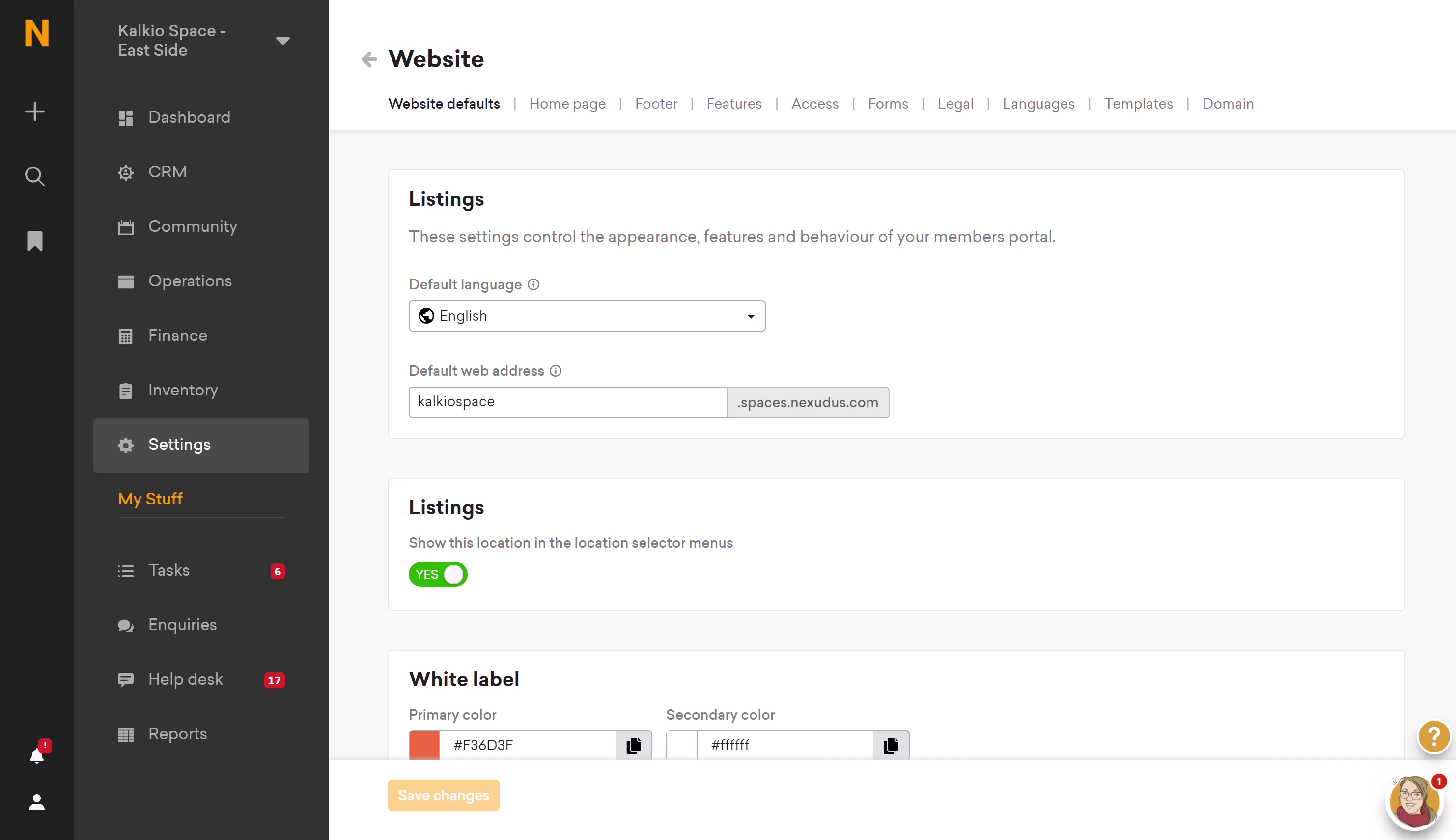
You will need to copy this prefix, and use it to replace the xyz in the below link when pasting into a new tab in your browser. 🠓
https://xyz.spaces.nexudus.com/en/versions/preview?v=4
That’s all! Try it out for yourself. We think you might like it...
We hope that you like our newly updated Members’ Portal! We truly believe that Version 4 will be the best yet, and we would urge those of you running on previous versions to make the move over. As we have mentioned, our development will be focussed on this version of the Portal - this is where we will be releasing new features in due course. If you have any questions at all about updating, please do reach out to our support team, who will be more than happy to assist you.
Related posts
-
Why a CRM is Essential for Coworking Spaces (And How to Choose the Best One)
A customer relationship management platform (CRM for short) is what organisations use to manage relationships and interactions with both existing and potential customers. Its primary function is to streamline operations and communications to ensure a smooth customer - and employee - experience, while improving profitability.
-
How the Right Coworking Software Can Transform Your Coworking Space
We all know that technology solutions are imperative to the day-to-day running of your coworking space, but the right coworking software can take it to the next level. It has the power to transform your coworking space into a highly profitable business, all while building a vibrant and engaged community. Let’s explore how the right tools can transform your coworking space.
-
New in Nexudus: Reduce no-shows & improve team bookings in your coworking space.
Meeting rooms are at the heart of collaboration in coworking spaces. Whether it's a brainstorming session, a client meeting, or a team catch-up, having a simple and efficient way to book and manage meeting rooms makes all the difference. But let’s be honest—there’s always room to improve the experience for your members.
-
Unlock New Revenue Streams with Our New Virtual Offices Module
The popularity of remote and hybrid working has prompted many organisations to rethink the way they utilise office space. Many have swapped their large, static HQs for more flexible satellite solutions that can accommodate a disparate workforce.
-
ViDA Compliance Guide: 8 Essential Steps for Coworking Spaces in the EU
Now that 2025 has arrived, the European Union's VAT in the Digital Age (ViDA) initiative is becoming a key topic for coworking spaces operating in the EU. But don’t panic—ViDA will be introduced gradually, with key changes taking effect from 2028. This major VAT reform aims to modernize tax reporting, combat fraud, and streamline compliance through mandatory e-invoicing and real-time digital VAT reporting for certain transactions.
-
Harnessing AI to Help Coworking Operators Understand Their Communities Better
After more than twelve years in the coworking industry, we’ve seen the movement evolve at an incredible pace, especially in recent years. Spaces have grown larger, making it harder for operators to truly connect with their communities. At the same time, expectations for higher service standards and increasing competition mean that creating tailored experiences and fostering long-term member engagement is more important than ever.